The following blog is on the various statistical techniques applied in market research and is by B2B International.
There are a number of various analytical techniques used in market research like: correlation analysis, regression analysis, factor analysis, cluster analysis, correspondence analysis (brand mapping), conjoint analysis, chaid analysis, discriminant/logistic regression analysis, multi dimensional scaling, structural equation modelling.
The whole set of multi-variate techniques can be divided into two groups: Interdependency methods and Dependency methods. All multi-variate analysis has more than two variables, and depending upon how you analyze the variables you categorize them into dependency or interdependency methods. Either you can take the variables and find out the interdependencies without any dependent variables or you can choose an a dependent variable and independent variables and find causality. All the interdependency techniques do the former and the dependency techniques do the latter.
Interdependency techniques: Factor Analysis, Cluster Analysis, Multi dimensional Scaling, Correspondence
Dependency techniques: Multiple Regression, Logistic Regression, Discriminant, Multi-variate ANOVA, Conjoint, Structural Eqn Modelling
CORRELATION ANALYSIS
Correlation analysis, expressed by correlation coefficients, measures the degree of linear relationship between two variables.
While in regression the emphasis is on predicting one variable from the other, in correlation the emphasis is on the degree to which a linear model may describe the relationship between two variables.
The correlation coefficient may take on any value between + and – 1. The sign of the correlation coefficient (+, -) defines the direction of the relationship, either positive or negative. A positive correlation coefficient means that as the value of one variable increases, the value of the other variable increases; as one decreases the other decreases. A negative correlation coefficient indicates that as one variable increases, the other decreases, and vice-versa.
The absolute value of the correlation coefficient measures the strength of the relationship. A correlation coefficient of r=0.50 indicates a stronger degree of linear relationship than one of r=0.40. Thus a correlation coefficient of zero (r=0.0) indicates the absence of a linear relationship and correlation coefficients of r=+1.0 and r=-1.0 indicate a perfect linear relationship.
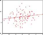
The scatter plots presented below perhaps best illustrate how the correlation coefficient changes as the linear relationship between the two variables is altered. When r=0.0 the points scatter widely about the plot, the majority fall roughly in the shape of a circle. As the linear relationship increases, the circle becomes more and more elliptical in shape until the limiting case is reached (r=1.00 or r=-1.00) and all the points fall on a straight line.
A number of scatter plots and their associated correlation coefficients are presented below:
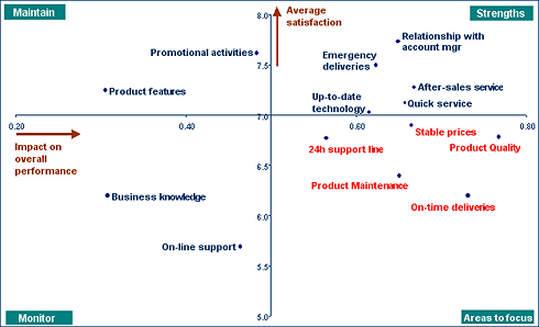
Correlation analysis is typically used for Customer Satisfaction & Employee Satisfaction studies to answer questions such as “which elements contribute most to someone’s overall satisfaction or loyalty?” This can lead to a “derived importance versus satisfaction” map. See below.
It is also ideal when sample sizes are too low (e.g. less than 100) to run a regression analysis.
REGRESSION ANALYSIS
Regression analysis measures the strength of a relationship between a variable you try to explain (e.g. overall customer satisfaction) and one or more explaining variables (e.g. satisfaction with product quality and price).
While correlation provides a single numeric summary of a relation (called the correlation coefficient), regression analysis results in a “prediction” equation. The equation describes the relation between the variables. If the relationship is strong (expressed by the Rsquare value), it can be used to predict values of one variable given the other variables have known values e.g. how will the overall satisfaction score change if satisfaction with product quality goes up from 6 to 7?
egression analysis is typically used:
| (i) | for Customer Satisfaction & Employee Satisfaction studies to answer questions such as “which product dimensions contribute most to someone’s overall satisfaction or loyalty to the brand?”. This is often referred to as Key Drivers Analysis. |
| (ii) | to simulate the outcome when actions are taken. e.g. what will happen to the satisfaction score when product availability is improved? |
FACTOR ANALYSIS
Factor analysis aims to describe a large number of variables or questions by only using a reduced set of underlying variables, called factors. It explains a pattern of similarity between observed variables. Questions which belong to one factor are highly correlated with each other. Unlike cluster analysis, which classifies respondents, factor analysis groups variables.
There are two types of factor analysis: exploratory and confirmatory. Exploratory factor analysis is driven by the data, i.e. the data determines the factors. Confirmatory factor analysis, used in structural equation modelling, tests and confirms hypotheses.
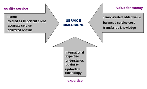
Factor analysis is often used in customer satisfaction studies to identify underlying service dimensions, and in profiling studies to determine core attitudes. For example, as part of a national survey on political opinions, respondents may answer three separate questions regarding environmental policy, reflecting issues at the local, regional and national level. Factor analysis can be used to establish whether the three measures do, in fact, measure the same thing.
It is can also prove to be useful when a lengthy questionnaire needs to be shortened, but still retain key questions. Factor analysis will indicate which questions can be omitted without losing too much information.
CLUSTER ANALYSIS
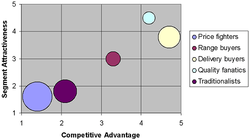
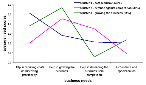
Cluster analysis is an exploratory tool designed to reveal natural groupings within a large group of observations. Cluster analysis segments the survey sample, i.e. respondents or companies, into a small number of groups.
Respondents whose answers are very similar should fall into the same clusters while respondents with very different answers should be in a different cluster. Ideally, the cases in each group should have a very similar profile towards specific characteristics (e.g. attitudinal or behavioural questions), while the profiles of respondents belonging to different clusters should very dissimilar.
Its main advantage is that it can suggest, based on complex input, groupings that would not otherwise be apparent ie the needs of specific groupings or segments in the market.
Cluster analysis is widely used in market research to describe and quantify customer segments. This enables marketers to target customers tailored to their needs instead of having one general marketing approach – see market segmentation.
CORRESPONDENCE ANALYSIS (BRAND MAPPING)
Correspondence analysis is a technique which allows rows and columns of a data matrix, e.g. average satisfaction scores for several products, to be displayed as points in a two-dimensional space or map. It reduces a complicated set of data to a graphical display which is immediately and easily interpretable. Brand maps are based on correspondence analysis.
Brand maps are often used to illustrate customers’ images of the market by placing products and attributes together on a map. This allows close interpretation of company perceptions with a variety of product and service attributes simultaneously.
Brands are most strongly associated with the attributes that are closest to them on the map. If products are placed close to each other, it means they have a similar image or profile in the market.
The relative association of brands with an attribute can be determined by drawing a perpendicular line from the attribute vector line (=line from the origin to the attribute point) to each of the brands. The distance between the brand and the attribute is the distance between the attribute location and where the perpendicular line crosses the attribute vector line.
The centre of the map (the cross on the map), represents the overall mean of each attribute, and is the centre around which the brands are dispersed. The more a brand tends to lie in a similar direction away from the centre as an attribute, the more a brand is associated with that attribute. This also means that brands and attributes near the centre of the maps are not differentiating. The length of an attribute vector represents the extent to which the brands differ on that attribute.
Angles between the vectors represent correlations between attributes. The smaller the angles, the more correlated the attributes are
CONJOINT ANALYSIS
Market research is frequently concerned about finding out which aspects of a product or service are most important to companies. The ideal product or service, of course, would have all the best characteristics, but realistically, trade-offs have to be made. The product with the most expensive features, for example, cannot have the lowest price.
Conjoint analysis is a technique for measuring respondent preferences about the attributes of a product or service. It is the ideal tool for new/improved product development. The conjoint analysis task asks the respondents to make choices in the same fashion as consumers normally do, by trading off features one against the other, either by ranking or choosing one of several product combinations. e.g. a task could be: do you prefer a “flight that is cramped, costs £250 and has one stop” or a “flight that is spacious, costs £500 and is direct”?
Using conjoint analysis, you can determine both the relative importance of each attribute (e.g. spaciousness, price, number of stops) as well as which levels of each attribute are most preferred (e.g. how much is a price of £250 more preferred than a price of £500).
Read further article: http://www.b2binternational.com/aboutb2b/techniques/quantitative/data.php




Thanks for sharing, I like this blog!